
Drawing a Chevelle
A quick glimpse into how I draw a car, from sketch to shaded rendering, using traditional tools.
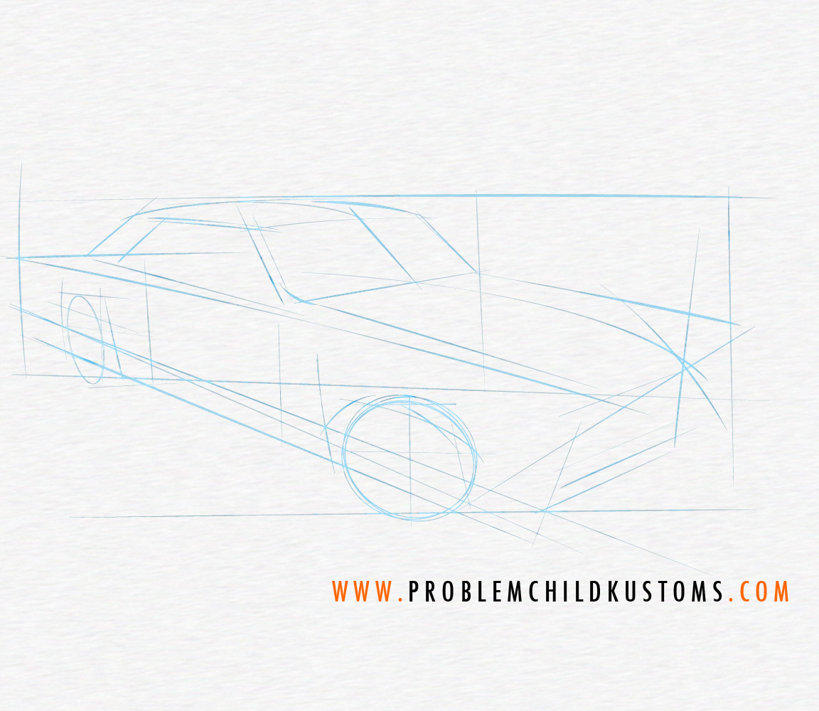
From humble beginnings: Let's start by plotting the angle of the car, and general proportions and perspective with some loose guidelines. Keep things very loose and general at this stage. All we're looking to do is get an idea of where the car is going to live on our paper.
Moving along on the tutorial, let’s clean up some of those sketchy guide lines, and start roughing-in the parts that will make this a Chevelle. We’re plotting and planning a place for all of the stuff that will need to show later on, so take your time, but keep it loose yet.

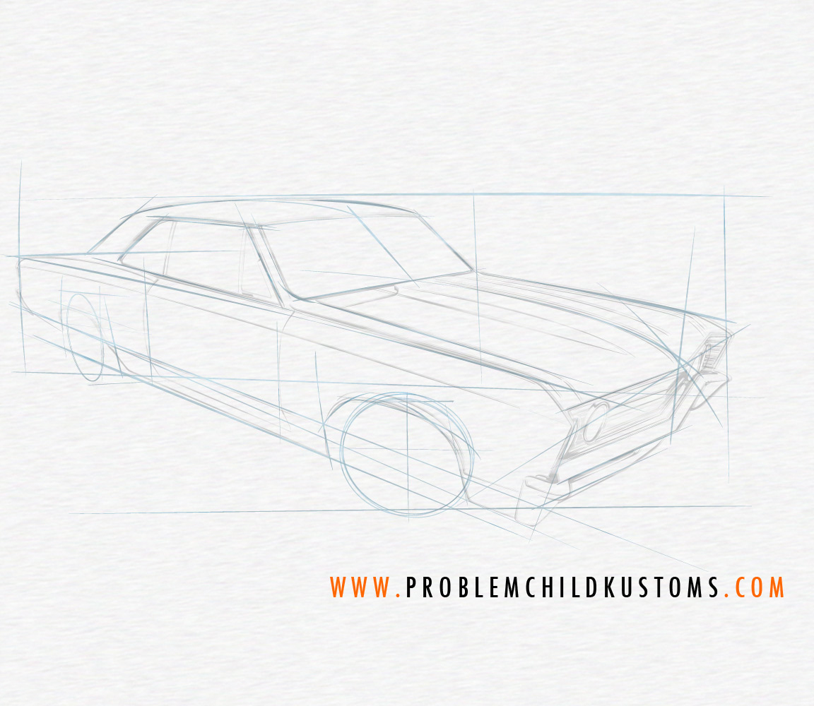
Onward with the tutorial! At this stage, I like to add the wheels, and start tightening-up those lines I know will be staying. I pay some extra attention to the front wheel, and keep in mind the offset for the rear. Start by laying in an arc to figure-out just where the wheel face will sit in the rim, and set the stance. You can see in this pic that I've changed my mind a few times already. Remember: circular and ellipse templates are your friend. Invite them to play along.
The tutorial continues... At this stage, I'm cleaning-up stray lines, and adding detail to the grille, bumper, wheels, and even some light shading. The Copic markers have come to play, dropping in the basic shadow, as well. It's starting to look like a car. Ive hinted at an interior, and did this mostly to draw the eye back a bit, and to give me a way to show that the windshield is sitting in front of the interior, with that big ol' reflection hanging out there. We'll need the eraser yet, as some stray lines are making some decisions for us by shading over them. We'll make it work.
Tutorial continues: Made in the shade...ing. Let's continue our theme of cleaning-up those stray lines, and get on darkening-up the shaded areas, lightening those areas that will get a blast of light, and, sadly, this pic doesn't show it too well, but I've started loosely adding some rally stripes, per the client's request. Again, we're working a bit tighter, and slowly building the tones. Easier to add a little at a time, than to start over when it's all blotchy and too dark. Still working with the Copics (neutral and toner grays at this stage).
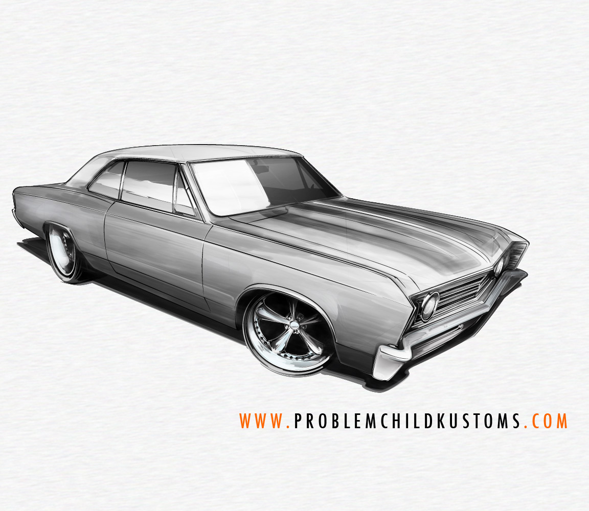
Let's finish this sucker before the end of the day. Moving along in the tutorial, let's get those stripes blocked-in (careful... careful!), and continue working the entire car. We'll darken up some lines, and detail some reflections on the bumper and wheels, as well as blending a bit on the shading. It doesn't have to be perfect at this stage, just needs to represent a light source, some reflected light from the ground, and show that the body panels have a slight curve.
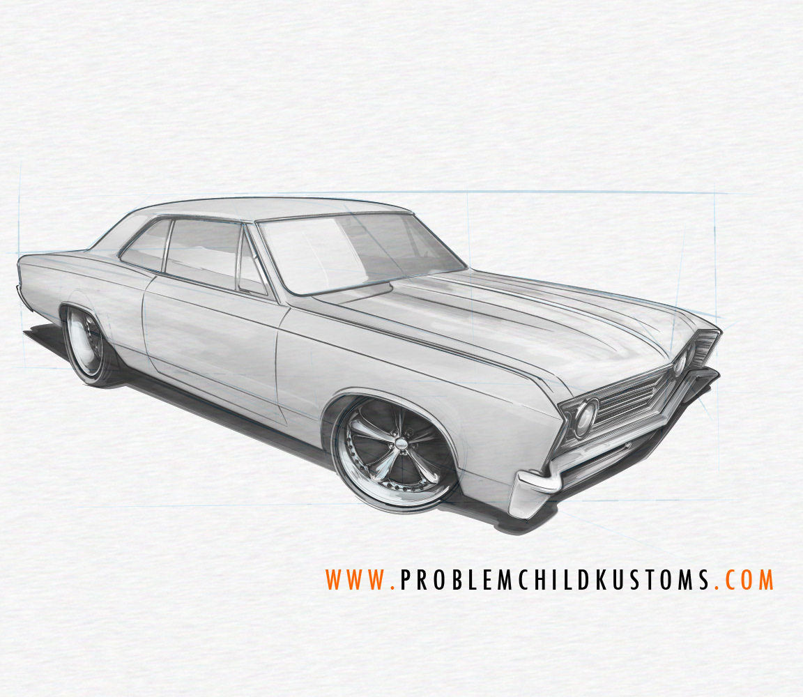
As the tutorial winds down... We're simply tightening-up the shading, and continuing to clean up any stray lines or smudges. We're starting to go over and darken-up some lines to bring that right front fender closer to the viewer, and making those quarters and roof sink back into space a bit. I'm also paying closer attention to the shadows cast on the wheels as they tuck into the fenders. This is where you can make the sketch a little more believable by creating the illusion of parts being in shadow, with light bouncing around a bit. Again, just have fun with it!

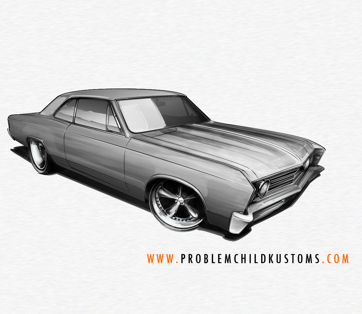
Finishing-up the 'traditional' part of the big how-to: Tightening-up those final details, lines and shading, blending in the tones, and adding a hint of color. We'll drop some orange in those stripes (per the client), and drop just a hint of blue and green into the glass and chrome. Normally, I'd have scanned this in a few steps back, but for our purposes today, this way just works. Hope you dug this look into the process... Working on some full-on, step-by-step tutorials as time allows, and those will hit soon, in a handy, easy-to reference guide. Keep at it, and above all, have fun, and work to observe lighting, shadows, and reflections, and just play with them in your work. Thanks, as always, for looking in!
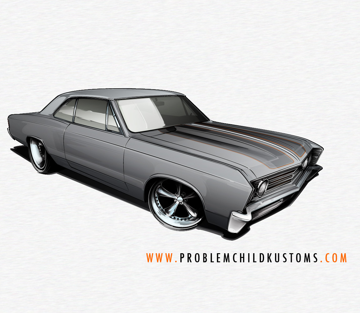
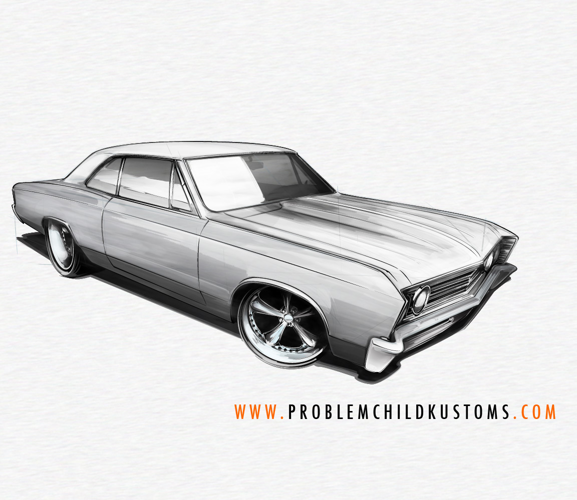
Dropping in some highlights... And we’ll bring in some greens and blues, to contrast the warm orange, and give some ‘glassy’ feel to the windows. Bring a touch of blue into the chrome pieces, just to make the metal there look cool, temperature-wise, and reinforce that the body color, even though it’s gray, is warmer. Bring in a white Prismacolor pencil, and add a few highlights and spots where the lighting might be a bit stronger (‘hot spots’)… This brings a little more reality to what is, essentially a slightly cartooned drawing (in proportion, anyway). Above all, just keep having fun, and don’t over-do it. Less is very much more at this point.
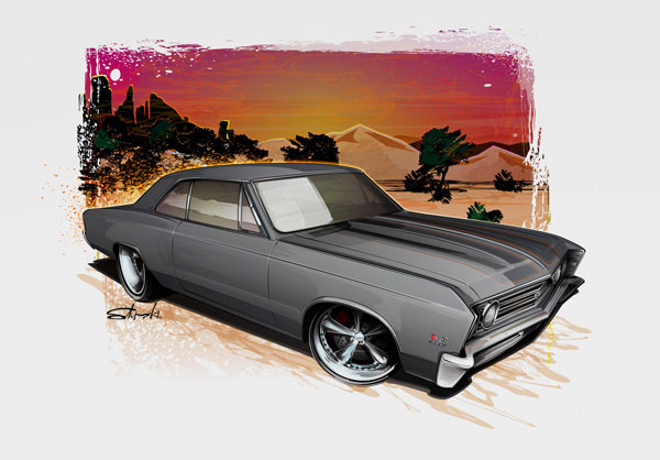
...and the finished deal. I'll cover the digital and background-y stuff soon... but just wanted to at least show where it's all headed!